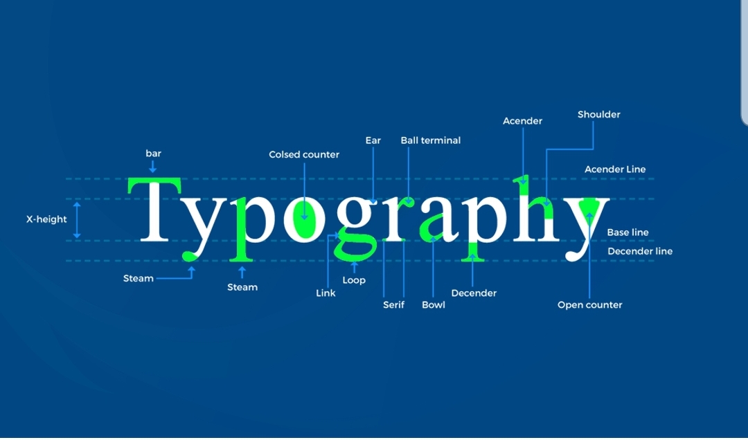
Typography often use more than one font – and combining them is a very difficult process. Fonts should be similar to each other, but not so much as to look like the same thing. They should not be critically different from each other so that it is convenient to read. Advice from us – do not use three or more fonts. There are some things you should consider if you are interested in a combination of fonts.
Look for similarities, little things that combine different fonts. By the way, usually it’s not a problem to free font downloads, just follow our link and make sure that it’s true. Be sure to distribute their roles, one font will be used only for headings, the other only for tedious long texts. In fact, this is called a hierarchy. Decorative fonts should be combined with something neutral. If you select two stylish fonts at the same time, the page will be inconvenient to read. Simple fonts should definitely be used for the body of the article, while decorative fonts are better for heading, obviously. You can use several fonts from the same collection, most often this solution saves a lot of time and is optimal. If nevertheless you decide to use different fonts, there is software that can help you with the choice. The simplest solution is the Google library, it will show the most popular combinations, and if you wish, something special. You can also specify the font that you liked, and Google will pick up good options to choose from (most likely).
Font size
Simple psychology works here, we tend to pay attention to the font only if it seems too large, or vice versa, too small. There are simple rules that you should consider and do everything according to the canons.
Conditionally, when we go to tell the visitor about our services, we want to do it in detail and in beautiful words – but this can have the opposite effect. It follows that we want to make the text bigger so that people pay attention to it. A bit complicated, right? Another important point is to adapt the font to mobile devices. Not always if the text looks great on the computer, it is also convenient to read it on the phone.
There are programs that standardize fonts for any device and tell you what the height and width should be. Just google it.
There is a very simple and old way to check the font. Take an ordinary paper book, put it at a distance at which it is convenient for you to read it, and attach it to the display. Just make the font size match what is in the book.
Mobile devices
Nowadays, phones have become the main gadget for surfing the Internet. Despite the fact that it is convenient to do this from a laptop, it is not always convenient to have a large laptop on hand. Therefore, in our realities, website creators must think through the mobile version to the smallest detail, because if it repels, it will repel most of the users. Most often, site owners are upset by this fact, because they have already created a website, and now they need to create and configure everything from scratch for a small screen. But it is important.

Leave a Reply