


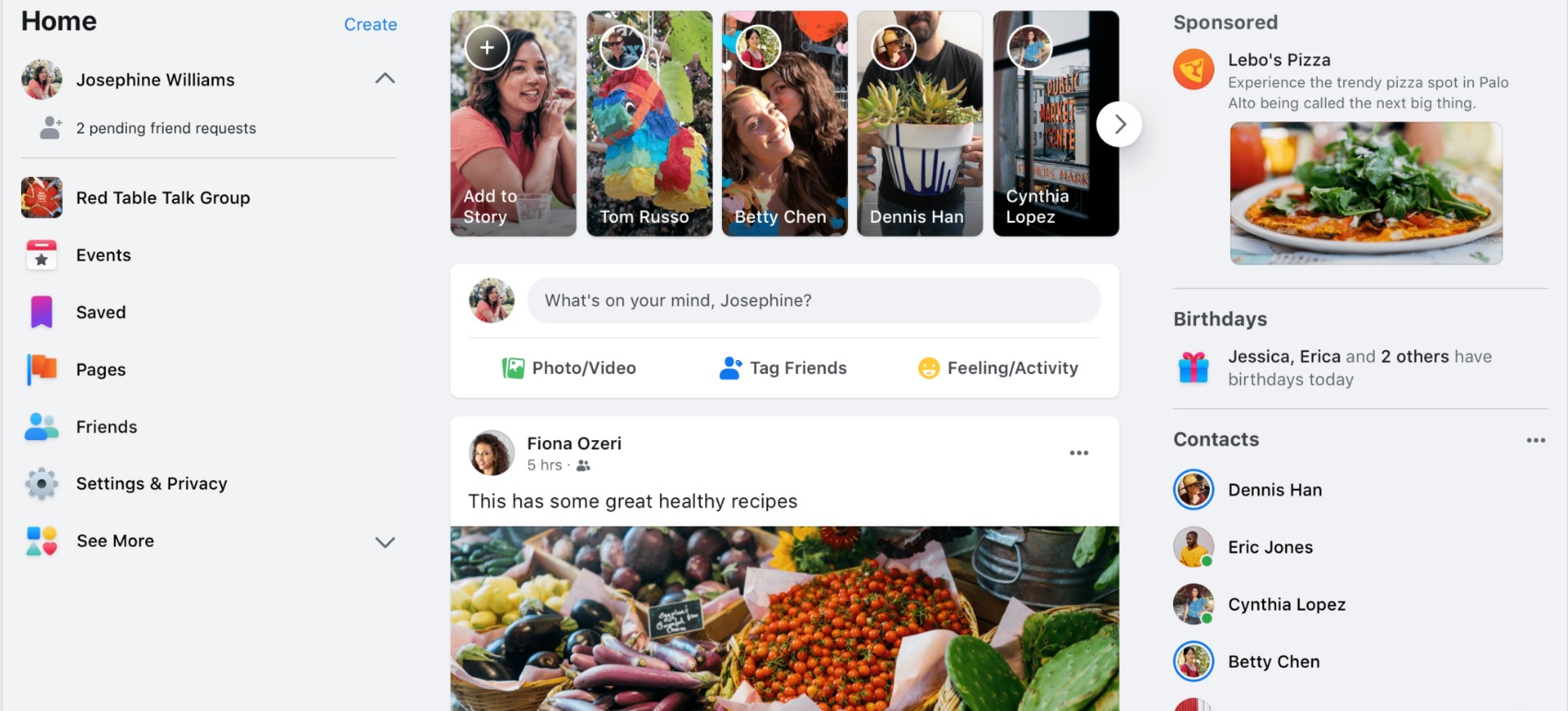
Facebook is revamping its user interface after a long time. It has not yet rolled out the updated interface but has started showing a demo version to the Beta users. Looking at the new look of the website, we got that Facebook is trying to accommodate almost everything in the single page. For example, now we have separate tabs for friend requests, notifications and messages at the top right corner of the web version, and at the top of the mobile version. With the new getup of the web version, the friend lists will have a separate space in the left side of the page, just above the list of the pages and apps of use. Right now, for the web version, there is no watch tab, marketplace tab, etc. With the new version, you will get mobile like tabs for marketplace, newsfeed, watch videos, etc.
A lot will be changed in the notification tab as well. Now, when you tap on the notification menu, a dropdown list opens which shows the notifications. The new look will open the notifications in a dedicated panel at the right side. Now, coming to the Friends or User profile, it has been made much simpler, with almost every option (photos, videos, post, timeline) in a single panel. Text font size will be bigger than before.
Another significant change is the Dark mode. Facebook is one app, that we use almost all day. To cut down the stress on eyes, Facebook has finally brought the dark theme. A plethora of other changes will also show up. Photos and video in Stories will open in fullscreen with an immersive layout. There might be some other changes here and there. Overall, these are the main changes, that will accompany Facebook very soon. Beta users will get to try the new version in no time sooner.

