Logo is one of the most vital aspects of a registered company. It is the face of the company. A unique and eye-catching logo invariably represents a company and entices more customers. The importance of logo on the face of the Internet has burgeoned so rapidly that numerous organizations have revamped their existing logos and even hold logo contests for getting innovative logo design ideas.
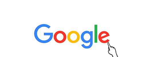
Google has been changing its logo for the past 17 years and probably will continue to do so in future also. But the new Google logo has more much to offer than its previous logos. The new logo is a multicolored simple and flat logo that aims to signify the multifarious services Google offers its audiences across the globe. When Larry Page and Sergey Brin started the company, they scanned through thousands of names and finally came up with Google. But at that time, Google was just for computer PC. Over the years, the world has received so many services from Google, that the name has been added as a verb in the dictionary. Google now has Google search, Google Maps, Chrome, Gmail, Google News, Books, Google Earth, YouTube, Google Plus, Hangouts, Android OS and so many more. Hence, the blue ‘g’ letter has been replaced by a multicolored capital ‘G’ which signifies the entire fraternity of services, Google stands for.
Google Logo’s journey over the years
In 1998, Larry Page and Sergey Brin first used this logo in their Stanford University.
30 August 1998, this is the first time Google used Doodle. Larry Page and Sergey Brin went on a weekend trip to Burning Man. This logo was used to tell viewers that they were out of office and will not be able to meet any technical issues.
Google used this logo when it moved to Google.com and released its Beta version to the world.
In May 1999, the company refurbished its logo and used the Catull typeface with a lot of shadow and emboss.
In May 2000, Google logo got a new round of renovation with reduced shadow and emboss.
After a long gap of 3 years, in September 2013, Google logo completely did away with shadow and went completely flat. Some typographical revamps were observed.
In 2015, after Google made the historic change of creating a new sister company Alphabet, it went on to brush up its logo. The new Logo consists of a flat multicolored Google logo and Google dots.
The new logo will roll out very soon in all devices and all platforms. Till then enjoy the video below:

Leave a Reply